Adaptive Forms Core Components
A closer look at the new components collection in AEM Forms
Introduction
Since AEM version 6.5.16, an alternative component collection for Adaptive Forms in AEM Forms has been available with the Adaptive Forms Core Components. This collection has been expanded piece by piece in the past service packs for AEM Forms, so it is worth taking a closer look at these Adaptive Forms Core Components. With this article we would like to provide a more detailed insight into the core components.
Anyone who is currently looking through the Adaptive Forms documentation at Adobe will often come across the following note:

Adobe recommendation for using the Core Components
Adobe itself recommends using the new Core Components when creating new Adaptive Forms. Adobe describes the Foundation Components as “old” or “classic”. However, the Foundation Components are by no means considered “deprecated” and should continue to be maintained and further developed. After all, a decent number of components and functionalities have accumulated over the years that have not yet fully made it into the Core Components.
Comparison of components
If you look at the individual components you can see some differences. The following overview shows a comparison of all components. The comparison was created based on AEM Forms 6.5.20. This overview also largely applies to the corresponding version in AEM as a Cloud Service (2024.1.0). However, this can differ in detail.
| Component | Core Components | Foundation Components | Differences / Notes |
|---|---|---|---|
| Accordion | ✔ | ✔ | In the Foundation Components, this function was implemented via the Panel component - Accordion Layout |
| Adaptive Form Fragment | ✔ | ✔ | Referencing of form fragments is implemented in the Foundation Components within the Panel component |
| Adaptive Form reCAPTCHA (CAPTCHA) | ✔ | ✔ | |
| Adobe Sign Block | ✔ | Adobe Sign Integration currently only for Foundation Components. But it should come soon for Forms Core Components | |
| Button | ✔ | ✔ | |
| Chart | ✔ | Currently no corresponding component in the Core Components | |
| Check Box | ✔ | ✔ | |
| Check Box Group | ✔ | ✔ | In the Foundation Components, this functionality is integrated into the Check Box component. Several check box values can be specified there, which are then put together to a checkbox group. |
| Date Input Field | ✔ | Year, month and day using separate input fields. Currently no corresponding component in the Core Components | |
| Date Picker | ✔ | ✔ | |
| Drop-down List | ✔ | ✔ | |
| ✔ | ✔ | ||
| File Attachment | ✔ | ✔ | |
| File Attachment Listing | ✔ | This component shows the current attachments in the form. Currently no corresponding component in the Core Components | |
| Footer | ✔ | ✔ | |
| Foot Note Placeholder | ✔ | Currently no corresponding component in the Core Components | |
| Form Container / Root Panel | ✔ | ✔ | |
| Form Title / Title | ✔ | ✔ | |
| Header | ✔ | ✔ | |
| Horizontal Tabs | ✔ | ✔ | In the Foundation Components, this function was implemented via the Panel Component - Tab Layout |
| Image | ✔ | ✔ | |
| Image Choice | ✔ | Currently no corresponding component in the Core Components | |
| Next Button | ✔ | ✔ | The Core Components are integrated into the Wizard component or can be implemented using the component button |
| Numeric Box | ✔ | ✔ | |
| Numeric Stepper | ✔ | JQueryUI (Stepper) widget with + / - buttons to control input. This widget is missing from the Core Components because they are no longer based on JQuery-UI widgets. An implementation would have to be realized as an extension of the Numeric Box | |
| Panel | ✔ | ✔ | |
| Previous Button | ✔ | ✔ | The Core Components are integrated into the Wizard component or can be implemented using the component button |
| Phone / Telephone | ✔ | ✔ | |
| Radio Button | ✔ | ✔ | |
| Reset Button | ✔ | ✔ | |
| Save Button | ✔ | Currently no corresponding component in the Core Components. Furthermore, it is unclear whether the draft function is even available in the core components. This feature has not yet been documented. | |
| Scribble Signature | ✔ | Currently no corresponding component in the Core Components | |
| Separator | ✔ | Currently no corresponding component in the Core Components | |
| Signature Step | ✔ | Currently no corresponding component in the Core Components | |
| Submit Button | ✔ | ✔ | |
| Summary Step | ✔ | Currently no corresponding component in the Core Components. | |
| Switch | ✔ | ✔ | |
| Table | ✔ | Currently no corresponding component in the Core Components. | |
| Terms and Conditions | ✔ | ✔ | |
| Text | ✔ | ✔ | |
| Text Box | ✔ | ✔ | |
| Vertical Tabs | ✔ | ✔ | In the Foundation Components, this function was implemented via the Panel Component - Tab Layout |
| Wizard | ✔ | ✔ |
It is noticeable that the basic form components are present in both variants. However, the Core Components are less extensive in detail. The lack of Adobe Sign components is particularly notable. These were currently missing but will also be made available for the core components in the near future.
In addition, the overview shows that some components from the Foundation Components are completely missing from the Core Components, such as: B. Image Choice, Table and the Chart component. These will probably not be ported to the core components for the time being. You have to evaluate for yourself whether these components are an essential part of a form construction kit. When switching to the core components, however, it should be taken into account that there will be corresponding development effort for these components if you want to use these components in a similar way to the foundation components. Nevertheless, there are many reasons that also speak for the core components.
Why it's worth switching!
Here we want to take a closer look at Adobe's promises:
"Headless" capable:
If you build your forms on the Forms Core Components, they can also be natively integrated into third-party applications via the so-called Headless Forms API. This is difficult to do with the existing Foundation Components as there is no dedicated API. A more detailed look at AEM Forms Headless will be available in a future blog post.
Availability on GitHub and comprehensive documentation:
Like the normal Sites Core Components, there is now also a project/repository on GitHub for the Forms Core Components. Not only is the code now publicly available, but the technical documentation contained there is also much more extensive than with the Foundation Components. This makes the development and expansion of the core components easier and faster. Known problems are now documented via GitHub and you can more easily report problems and possibly even correct them yourself. Without a doubt, Adobe is heading in the right direction here.
BEM model as a basis for style sheets (CSS):
The Block Element Modifier (BEM model) is a proven standard and frequently used method for organizing CSS. This makes styling the core components much easier. Compared to the Foundation Components, the CSS is easier to customize and easier to understand. This significantly speeds up and simplifies the creation of your own themes for the forms.
No dependency on third-party libraries:
With the Core Components, Adobe forgoes the integration of JQuery, JQuery-UI and Underscore. This not only makes it easier to integrate the forms into existing applications but also significantly reduces the Javascript load. The Page Speed Index is also happy about this. However, the so-called Forms Core Components Runtime library is not entirely narrow. At just under 100 kB, however, you are a long way from the almost 300 kB Javascript for the Foundation Components. Here too you can attest to Adobe's progress.
Focus on performance and accessibility:
Adobe promises high Lighthouse Scores for the Forms Core Components, compliance with the Core Web Vitals and compliance with accessibility standards and guidelines. These are all things that you can currently expect or should expect from a modern set of components. However, the extent to which there is a significant improvement compared to the foundation components would have to be determined in a more detailed analysis. The Foundation Components also have accessibility features. When it comes to performance, however, it's worth taking a look at the core components. These are significantly lighter and therefore have good conditions for dealing with larger data models or forms.
Versioning:
Similar to the Core Components in AEM Sites, the Core Components in Forms are now also versioned. This means that with “breaking changes” the components are always provided with a new version. This ensures that your own styles and extensions continue to work without having to update your own components. This makes AEM upgrades in particular much easier to carry out because you can assume that your own extensions to the core components will also work with a newer AEM version.
What is changing in authoring?
In addition to the improvements mentioned above, Adobe has also made changes to the authoring interface with the introduction of the Forms Core Components. Authoring forms with Core Components is now identical to authoring components in Sites. This essentially results in the following differences.
Touch UI Dialogs
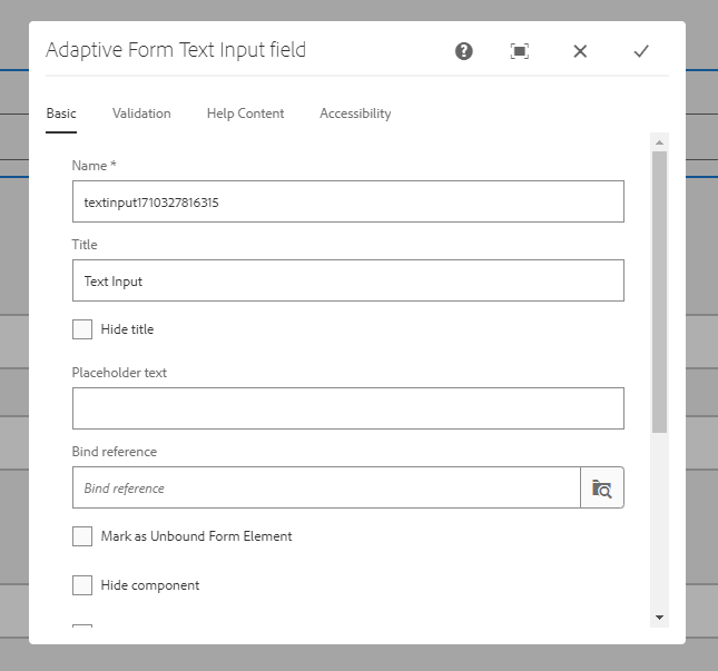
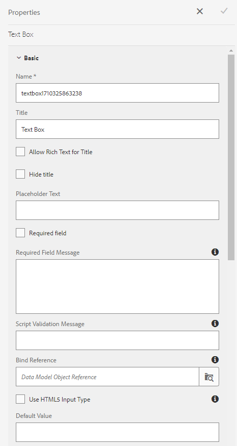
The WYSIWYG editor is now the same as in AEM Sites. This specifically means e.g. For example, the form components have regular Touch UI dialogs and are not edited in the side panel. The dialog boxes are then essentially identical for most components. This means that the basic functions for validation, help texts and data model remain the same. However, there may be small differences in detail with some components, see screenshots.

Text Input Dialog Core Components

Text Box Panel Foundation Components
Rule Editor
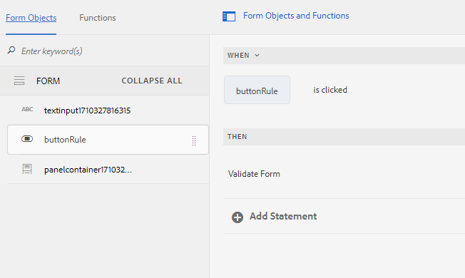
The Rule Editor known from the Foundation Components is also available for the Core Components, see figure. The actions controlled via this are largely retained. So you can still create your form rules and functions using a visual editor. Service calls, standard functions and the integration of so-called custom functions can still be used. The GuideBridge API is also retained. On the functional side of the Rule Editor, a lot of things remain the same, although there is one exception.

Rule Editor Core Components
Code Editor is missing
However, there is a limitation when it comes to authoring. The code editor for the rules is no longer available with the core components. Any functionalities must therefore be implemented in custom functions.
No Classic UI
Adobe has cut the old cords and editing Adaptive Forms based on Core Components will only be possible in the Touch UI. In contrast to the Foundation Components, the Core Components no longer provide Classic UI dialogs. Adobe is acting consistently here. Using the Classic UI should no longer be an option for authoring in AEM anyway.
Conclusion
In the end, it should be noted that Adobe has laid a new basis for form development in AEM with the Adaptive Forms Core Components. This base is simply better than the Foundation Components in terms of adaptability, maintainability and stability. In most cases you should therefore rely on the core components. Adobe will provide basic missing functionality (e.g. Adobe Sign Integration) for the core components in the near future. In the long term, the Foundation Components will therefore be phased out.

